Introduction
Fragments in SAPUI5 are a powerful feature designed to streamline the development of reusable UI components. By enabling modularity and reducing redundancy, fragments enhance application maintainability and scalability. This guide provides a detailed overview of SAPUI5 fragments, their types, benefits, and implementation techniques, complete with practical examples to help you master them.
What Are SAPUI5 Fragments?
A fragment in SAPUI5 is a lightweight, reusable snippet of UI code that is defined in XML, HTML, or JavaScript. Unlike views, fragments do not have their own controllers; instead, they rely on the controller of the view they are embedded in. Fragments are commonly used for dialogs, popups, form sections, or any UI component that appears multiple times across an application.
Key Characteristics:
- Reusable across multiple views.
- Do not instantiate their own controller.
- Lightweight and easy to manage.
Advantages of Using Fragments
| Benefit | Description |
|---|---|
| Reusability | Write once, reuse across multiple views to avoid duplication. |
| Modularity | Break down complex UIs into smaller, manageable components. |
| Performance | Fragments are lightweight as they don’t require a dedicated controller. |
| Maintainability | Centralized updates to UI logic, reducing development effort. |
Types of Fragments in SAPUI5
SAPUI5 supports three types of fragments:
| Fragment Type | Description | Use Case |
|---|---|---|
| XML | Defined using XML tags, integrates seamlessly with XML views. | Standard and widely preferred. |
| HTML | Defined using HTML syntax. | Custom-designed UIs with specific needs. |
| JS | Defined programmatically using JavaScript. | Dynamic UI creation. |
Among these, XML fragments are the most commonly used due to their simplicity and compatibility with XML views.
Different Fragment Types by Usage
Fragments can be used to define various reusable UI components. Here are some of the most commonly used types and their definitions:
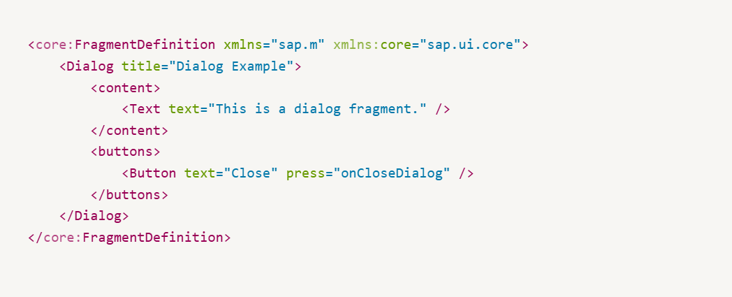
1. Dialogs
Dialogs are used to display modal windows with content and user actions. They are commonly used for forms, confirmation messages, or detailed views.
Example: Dialog Fragment
2. Popovers
Popovers are floating containers used to display contextual information or options. They are commonly triggered by clicking or hovering over a UI element.
Example: Popover Fragment

Step-by-Step Guide to Using Fragments
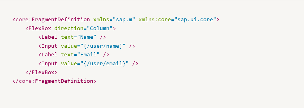
Step 1: Create the Fragment
Define the fragment in the webapp directory. The naming convention for fragments typically follows <name>.fragment.xml.
Example: A Simple Form Fragment
Step 2: Load the Fragment Dynamically
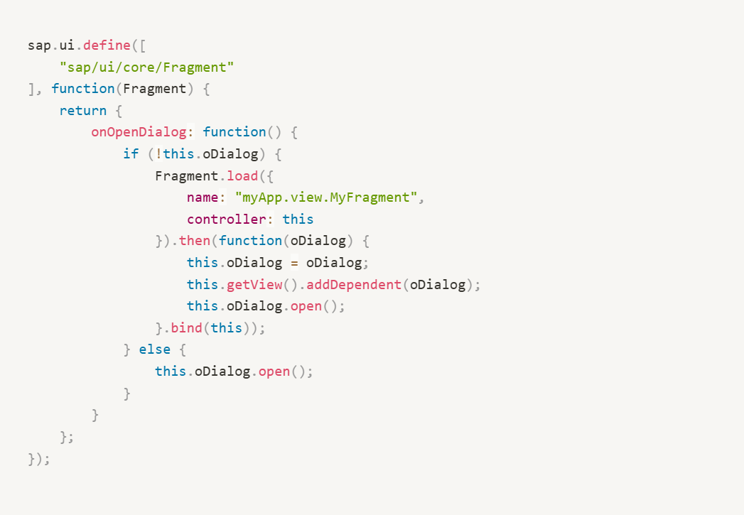
Fragments can be loaded dynamically using the Fragment.load method. This allows you to use them only when needed, improving performance.
Controller Code:
Step 3: Embed the Fragment Statically
In some cases, fragments can be embedded statically into views for simpler usage.
View Example:

Event Handling in Fragments
Fragments rely on the parent view’s controller for handling events. Attach the event handlers as you would in a regular XML view.
Fragment Example:

Controller Code:

Advanced Fragment Usage: Nested Fragments
Fragments can include other fragments to create complex, modular UI components.
Parent Fragment:

Child Fragment:

Best Practices for Using Fragments
- File Naming: Follow consistent naming conventions for easy identification (e.g.,
MyFragment.fragment.xml). - Reusability: Use fragments for common components like dialogs and forms to reduce redundancy.
- Controller Logic: Keep event handling in the parent view’s controller for better maintainability.
- Performance: Load fragments dynamically when possible to optimize performance.

